
I started out this site with a free template that I found online. I prefer to do my own web design so my site isn't exactly like other sites, but sometimes with blogs I like to start putting content up first, then work on the design later. Using a free template is cheap and easy.
Once there's some content on the site, and I've included the gadgets I'd like to use for the site, I like to create a new template from scratch. In this post I'll describe the process I use to create blog templates.
The process is similar for most types of websites, only the last section is specific to Blogger.com.
Overview
Before you get started, it's a good idea to download your template and save it on your local hard drive in case you encounter problems.
There are 5 basic steps:
- Find a Stock template with similar layout.
- Start posting and adding gadgets so there's something to work with
- Mock up the site in a graphics program.
- Create a standard HTML file for the layout.
- Add Blogger related code
Find A Stock Blogger Template
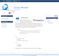
In this instance I started with a free Blogger template. Most of the time I'll just start using plain HTML tags to get content up, but for most blog services/software, there are plenty of free templates available.
What I was looking for in a template was something that was mostly plain and that had a 3 column layout. I chose Tecno World. Because it was similar to what I had in mind.
I chose not to use one of the standard templates that Blogger.com provides for a few reasons. There are so few and so many are using them, at least with a third party template, fewer people are likely to be using it. Since I will have the stock template up for a while as I add content, I want something reasonably nice.
Start posting add gadgets
Once I get the new template online, I start creating content. I find it much easier to do web design if there's some content to work with. It also gives me a chance to see if I enjoy writing on the subject without investing much time or money.
Next I'll start adding widgets/gadgets to the site. Some people go overboard with these but I prefer to stick to gadgets that I think will be useful for visitors of the site. Typically, items that help with navigation, such as tag lists and previous posts, recent posts and a blog roll so visitors can find related content.
I don't add crap like local weather, time, things that spin for no reason, etc. People don't care what time it is here or if it's raining or sunny.
At this early stage, I don't worry about ads unless I start getting a ton of traffic right away, which is rare in most cases.
Mock up in Graphics Program

I find it easy to use a graphics program such as Photoshop or The Gimp to do this. The image on the right is the mock up I created for this site. It started as a blank page and I started adding elements to it.
It is much easier if you put as many discrete items on their own layer as practical. Both Photoshop and The Gimp allow you to create layers. With layers, you can easily hide, reposition and resize different components of your site. Photoshop is a little nicer in that you can also group layers together and reposition and resize them as one unit.
The first step for me is to determine the overall layout. At this point, I'm just creating colored boxes that I can easily move and reposition. The main segments that I was focusing on were:
- Header - to put site branding so the visitor has an idea what the site is about.
- Footer - to put copyright information, privacy policy links, etc. The content varies by site but mainly something to keep the site tied together visually at the end.
- Main Navigation - these are the links to high level or important ares of the site.
- Detailed Navigation - more granular links to help visitors find content that isn't on the front page. In this case Label lists and Blog Archive gadgets.
- Main Content Area - where the blog posts will go in this case
- Highlighted content - where I want to feature certain links or information. In this a blurb about the site, recent posts and a blogroll.
It's easier for visitors to read text that are on shorter lines, so using a three column layout helps achieve that as well as leaves room to feature some content.
The overall width of the page is 990px which fits nicely in a maximized browser on a 1024x768 screen. Figuring out how to proportion the columns can be a bit tricky.
I started with the left and right columns and decided the center would be my main content area. Even though I may not put ads on the site, I still like to think about ad placement in my web designs. For that reason I went with 160px for the left and 336px for the right columns.
This gives me room for popular ad format. The left column can accommodate a 160x600 skyscraper, 160x90 link unit and 125x125 button. I've found that AdSense link units do well around navigational areas.
The right area at 336px can accomodate the large rectange (336x280), two wide skyscrapers side by side, two 125x125 buttons and more. It leaves plenty of room to split up into two columns if necessary.
The main content area is what's left over, 494px minus padding to provide whitespace. This is a good width for easy reading and it allows room for thumbnail images to float in the content as well as large enough images to take up the entire width and provide good detail. As far as advertising, a 468x80 slot would fit in nicely and there is enough room to float an ad in the blog content. 250px or less would leave enough room for text and the ad to work well.
That was the second combination I tried. At first I started with a 300px right side and 960px overall width. After adding the content to the mock up I thought it would look better if I filled the screen out more. The extra width didn't make the post area too small which is my primary concern.
Since I already started adding content and gadgets I could copy and paste and take screenshots to make the mock up more complete. It won't look exactly the same but it gives me a very good idea.
As you can see, I added some sample ads as well to make sure everything will fit in nicely. I'm still undecided about putting ads on this site but I like to know I don't have to go crazy reworking the template if I decide to.
Mock Up the Web Design in HTML
Now that I know what the site should look like, it's time to create an HTML version of the mock up to make sure that my ideas translate well into HTML. For this I just use Textpad. It's a simple text editor that has syntax highlighting. It loads quick and is easy to work with. To preview the design I use Internet Explorer 7 since it's the most popular now. Then I also check the design in Firefox and IE 6 using Multiple IEs and make any necessary changes so the HTML looks fine in all. If sites look fine in FireFox and IE they should look good enough in other browsers and in most cases I don't get enough traffic from other browsers on my sites to justify the time. Too bad, I'm looking for a good reason to pick up a PowerBook.
I've designed enough sites though that I already know what the HTML should look like when I'm designing the site in the graphics program. How hard or easy something is to do factors in when I'm drawing out the site. For instance, rounded corners are a pain sometimes so I left them out of this design. I've also gotten tired of seeing rounded corners everywhere.
Since I'm doing this web design for a blogger template, I'm keeping the style in the same HTML document instead of a separate CSS file.
It is important to note that Blogger.com needs the doctype of the template to validate to XHTML 1.0 Strict, which doesn't let you get away some things you can do in regular HTML. You'll also need to add the appropriate DOCTYPE tag and xml namespace information to the root HTML tag. So the first two lines of your HTML should look like:
<!DOCTYPE html PUBLIC "-//W3C//DTD XHTML 1.0 Strict//EN" "http://www.w3.org/TR/xhtml1/DTD/xhtml1-strict.dtd">
<html xmlns='http://www.w3.org/1999/xhtml' xmlns:b='http://www.google.com/2005/gml/b' xmlns:data='http://www.google.com/2005/gml/data' xmlns:expr='http://www.google.com/2005/gml/expr'>
Other than that, I just create the HTML mock up like I would any other document, following normal standards and SEO conventions. The goal is to get the mockup looking like the graphical mockup and the next step will introduce the changes necessary to turn it into a template.
- Create a standard HTML file for the layout.
- Add Blogger related code


comments:
Thank you for great article :)